
A good screenshot can make you want to play. A distinctive visual language can do something stranger: make you recognize a game from a character’s outline, the bend of a building, or the way a menu heading sits on the screen.
That recognition is not the same as realism. Nor does it necessarily arrive with more detail. Sometimes the feature that survives in your memory is a carefully preserved absence: an uncluttered stretch around a character, a background that refuses to compete, a silhouette that does not need a face to announce itself.
The useful question is not simply whether a game looks expensive. It is whether its visual decisions seem to belong together—and whether that coherence survives the things players actually do, including moving, looking away, and reading in another language.
A silhouette is an introduction, not the whole personality
Valve’s character-art guidance for Dota 2 makes recognizability practical. It asks contributors to consider a character’s silhouette, the direction the character faces, and the in-game view rather than only the more flattering inspection screen. The same guide cautions against unrelieved detail: quieter areas help the important shapes remain legible. These are instructions for that game’s contributors, not a universal recipe for every game. 1
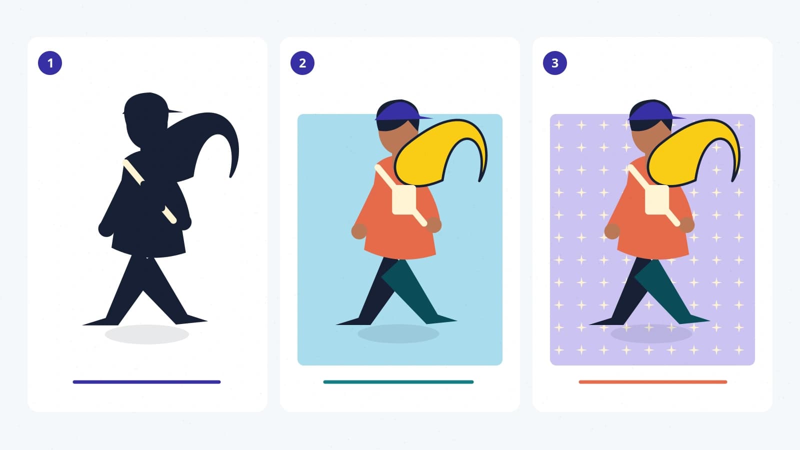
Try a small design exercise with an invented character: a courier carrying an enormous crescent-shaped parcel. Remove the eyes, the jacket stitching, and the tiny labels. The parcel and the courier’s forward lean still suggest a particular figure. Now replace the parcel with a perfectly ordinary backpack. More costume detail will not necessarily restore the memorable outline.
This is not an argument for making everyone visually extreme. An ordinary-looking character can be distinctive through gesture, framing, or context. It is a way to separate identifying information from decoration. The question is which decisions still do useful work when the image becomes small.
A striking shape can also be a poor fit for play. Imagine the courier’s parcel hiding every doorway. Recognition has improved, but understanding the character’s position has become harder. Art direction has to negotiate both impressions rather than maximize one in isolation.
Detail needs somewhere to stop
Consider two fictional market squares. In one, every stall, cobblestone, sign, and coat competes for attention. In the other, the foreground contains a few crisp shapes while the buildings behind it settle into broader areas of color. Neither is automatically the better picture. They ask you to look differently.
For our courier example, the second arrangement leaves space around the moving figure. That space can help the character’s pose matter. A small gesture does not have to defeat a hundred equally emphatic background marks.
One useful viewing exercise is to shrink a screenshot you are permitted to use to the size of a story card. What remains? A luminous doorway? A character’s distinctive shoulder line? A field of equally bright fragments? This is a subjective inspection, not a measurement of the game’s accessibility or artistic quality. It can nevertheless reveal where the picture places its emphasis.
Color belongs in that examination, but not alone. A yellow coat and a purple wall might separate beautifully for one viewer while shape, brightness, or motion still needs to carry information for another. Ask what the image offers beyond the color names you can attach to it. A recognizable palette should not be the only way an important distinction is communicated.
A process can leave a recognizable trace
Unity’s developer case study of Cuphead describes artwork penciled and inked on paper, colored in Photoshop, and combined with watercolor backgrounds. Those documented production choices help explain why discussing the game only in terms of image sharpness would miss much of the work. The materials and workflow are part of its visual identity. 2
That does not mean a handmade process is automatically superior. A rough-looking line can be carefully manufactured, and a clean digital surface can be a deliberate artistic decision. What interests us as viewers is the relationship between the chosen process and the finished impression.
Think of our imaginary courier in three versions: an angular paper cutout, a softly painted figure, and a glossy miniature. Keep the pose identical. The same action now suggests different worlds. The first might make the movement feel graphic and abrupt; the second might foreground atmosphere; the third might encourage you to notice the character as a small object occupying space. These are possible readings, not fixed meanings assigned to materials.
The distinction becomes richer when the figure moves. Does a step feel springy, heavy, hesitant, or precise? An illustrated character whose motion appears unrelated to its shape can produce an intriguing contrast—or an accidental disconnect. Either way, the still image is only one part of the experience.
The words on the screen belong to the artwork
A game’s typography can lose its identity during translation even when every sentence is accurate. In a 2019 Xbox interview about Cuphead localization, Studio MDHR discussed working with calligraphers on Japanese, Korean, and Chinese lettering, researching period print references, and adjusting layouts for different text lengths. The account describes localization as visual work as well as linguistic work. 3
There is a useful lesson here for readers as well as developers: letters are shapes with jobs. A title can feel playful or formal before you have read it. But that visual character must coexist with an actual reader’s ability to recognize the writing.
Imagine translating a compact sign in our courier’s market. The translated phrase is longer. Squeezing the letters until they fit preserves the rectangle but may destroy both readability and the intended personality. Enlarging the sign, changing its line breaks, or revisiting the surrounding composition could preserve more of the experience.
This is why consistency should not mean forcing every script to imitate the proportions of Latin letters. The more meaningful question is whether the new lettering feels at home in the same world while remaining natural to its readers. A successful adaptation can resemble the original in spirit without tracing its outline.
Recognition is a relationship between decisions
It is tempting to identify a game’s style with a single ingredient: low-resolution pixels, watercolor, bright outlines, muted colors. But an ingredient is not the same as a visual system.
Our invented courier might have angular limbs, curved buildings, and flowing handwritten signs. Those choices do not have to match geometrically. Their contrast could be the point: a brisk, practical figure moving through a generous, unruly city. The question is whether the contrast seems purposeful and continues to make sense across characters, environments, and interface elements.
A coherent game can also change its visual language. A new place may feel colder, emptier, or more formal. That difference has greater force when there is an established baseline to depart from. Recognizability need not require every scene to look identical.
Next time a game’s look catches your attention, try naming three decisions rather than one style label. Perhaps the figures have unmistakable outlines, the backgrounds leave breathing room, and the lettering has a buoyant rhythm. Then ask whether movement supports those impressions or complicates them.
You do not need to reverse-engineer the artists’ intentions to enjoy the result. Distinguish what you can see from what a developer has actually explained. Between those two kinds of evidence is a rewarding way to look: not merely asking how much detail an image contains, but noticing how confidently it decides what deserves your attention.