A game’s image arrives already doing several jobs. A character has to read at a glance; a town has to invite movement; an animated gesture has to last exactly as long as the action needs. An art book can give those decisions room to be considered separately. The interesting question is what kind of evidence it preserves: an early possibility, an explanation, a working exchange or an image prepared for another medium.
These ten books offer ten starting points. Their contents and edition details below come from freshly read publisher descriptions, editorial introductions and public creator interviews. This is a guide to reading purposes, rather than a report of having read every page or handled every volume. Where an interview supplies context outside a book, that distinction matters: a recollection can suggest a question without becoming a caption for an unseen page.
1. MOTHER2のひみつ。 — reading a game as an archive
Ohta Publishing’s Japanese contents list places development history, a gallery, Shigesato Itoi’s handwritten words, music, goods and staff discussion within the same volume. The publisher describes material from the 2024 exhibition alongside documents that were not shown there. The ordinary Japanese edition has 320 pages and ISBN 9784778319533; the poster edition has a different ISBN.
That range suggests a way to read beyond the polished image. Ask whether an item records work while it was happening or recalls it afterwards. A rough plan, a later interview and a finished illustration can illuminate the same decision from different positions. In a separate Hobonichi interview, Itoi connects commissioned clay figures with wanting more control over how characters were represented. The site explicitly presents interview material that did not fit in the book. Keep that companion testimony distinct from what the printed volume contains.
2. Kirby: Art & Style Collection — following identity across materials
VIZ’s English edition record identifies a 272-page hardcover published on April 14, 2020, surveying 25 years of Kirby. Editor Joel Enos’s public introduction describes a range extending beyond game artwork into novels, a concert, toys and stamps. Its preview captions also identify work for a claymation-like appearance and rough toy sketches. Those are descriptions of the book’s range, rather than evidence that one material explains every Kirby production.
Read for the negotiation between a recognisable identity and a new surface. A rounded drawn shape, a sculpted object and a manufactured toy impose different problems of edge, volume and construction. When comparing material presented in the collection, ask what stays legible and what has to be rebuilt. Recognition need not mean literal sameness. This retrospective can support that question without supplying a technical account of every later game; its 2020 edition boundary is part of understanding what it can tell you.
3. スプラトゥーン イカすアートブック — tracing the culture around a design
The original Japanese Splatoon art book is the 320-page KADOKAWA volume published in October 2015. The publisher lists concept sketches, graffiti and objects, weapons, gear, and early approaches to the squid characters’ appearance and movement. This is the first game’s book, with its own edition identity; the contents should not be silently expanded to include the sequels.
Its variety offers a useful way to consider a visual world as a network of tastes. Compare what clothing, lettering and equipment suggest about the people who inhabit it, rather than treating them as unrelated decorations. In a separate Nintendo interview, Hisashi Nogami connects the team’s interests with street fashion and discusses rock music in relation to the play they were imagining. That testimony gives cultural context, not a universal explanation for each sketch. A productive reading would test how several design categories reinforce one another, then keep open the possibility that a particular object serves a different purpose.
4. ゼルダの伝説 ブレス オブ ザ ワイルド マスターワークス — separating two kinds of history
The producing publisher’s Japanese guide divides this 416-page volume into artwork, making and history, alongside interviews. The making chapter includes development artwork and staff comments. The history chapter instead examines the fictional world’s chronology and traces in its terrain and buildings. The edition discussed here is the 2017 Japanese Master Works for Breath of the Wild, produced by Ambit and published by Tokuma Shoten. Its story material warrants a spoiler warning.
The reading opportunity lies in that division. A development explanation asks how a place was designed; a fictional history asks what happened in the place. Both may make a landscape more interesting, but they answer different questions. Try keeping two columns of notes: one for production evidence and another for the world’s own past. A ruined wall might participate in both, yet an account of an imagined disaster cannot by itself establish why an artist chose a particular silhouette. Let the chapters sharpen that distinction before bringing the two histories into conversation.
5. ペルソナ5 公式設定画集 — taking alternatives seriously
KADOKAWA’s record for the 2016 Japanese volume lists 512 pages, early character designs, rough drawings and original proposals. It also identifies character commentary and a long interview with designer Shigenori Soejima, together with opening-movie storyboards. The selected edition concerns the original Persona 5; later additions should not be inferred from its title.
A rejected-looking option can be more interesting than a polished result, but it needs careful handling. Start by describing a difference: the balance of a pose, the arrangement of clothing, the emphasis of a face. Then check whether accompanying commentary explains its role. An alternative image alone cannot establish that it failed, came first or was abandoned for the reason you suspect. The presence of commentary creates an opportunity to compare explanation with visible choice. Storyboards introduce a second question: how does a design remain readable when its presentation unfolds through time? That is a purpose for approaching the listed material, not a claim to have examined a particular sequence in these pages.
6. GRIS. ARTBOOK — making room for the environment
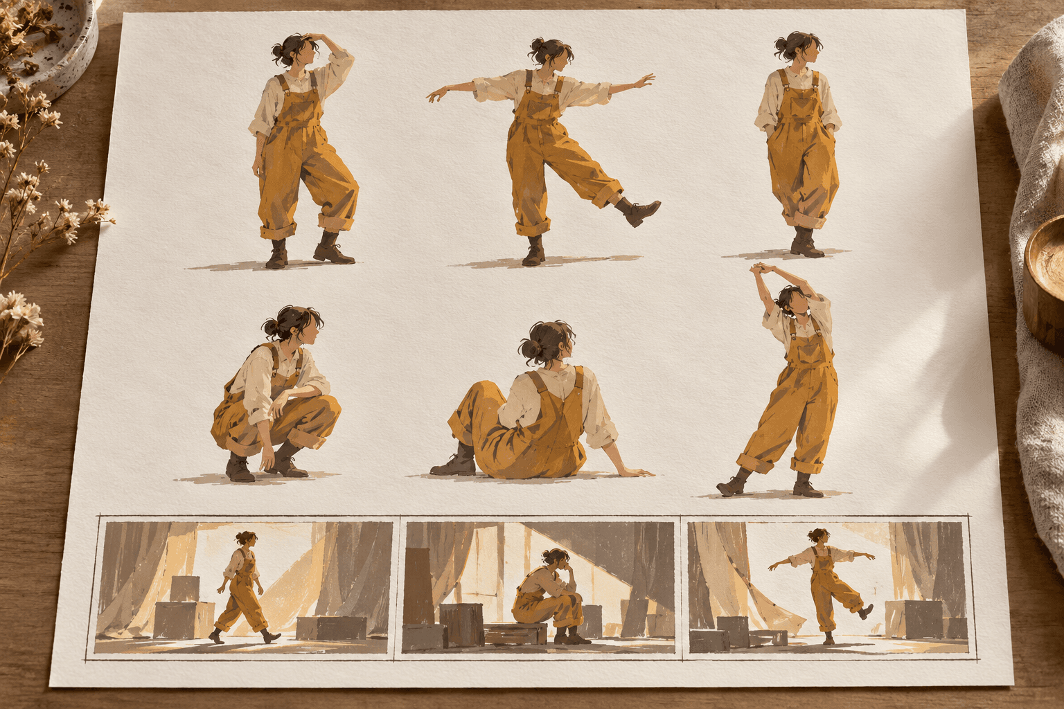
Norma Editorial’s Spanish record identifies Conrad Roset’s 176-page colour book, ISBN 9788467940275. It describes material ranging from first sketches to character and level design. This is the selected original edition. In a separate Spanish interview with Marina Amores, Roset explains that adapting his work to GRIS meant giving environments and composition considerable importance. He describes the project as beginning with an artistic idea that then needed a world, narrative and gameplay.
That account suggests reading for the space around a figure. Ask how architecture, scale and empty area contribute to the arrangement, and how a level’s design might turn an image into somewhere to move. Colour can be part of this inquiry without every colour change needing one fixed emotional translation. The interview helps establish the importance Roset gives composition; it does not prove how an unseen printed sketch became a playable space. Hold the question at that useful scale: what does an environment ask the figure, and eventually the player, to do?
7. Sea of Stars: The Concept Art of Bryce Kho — looking for the conversation
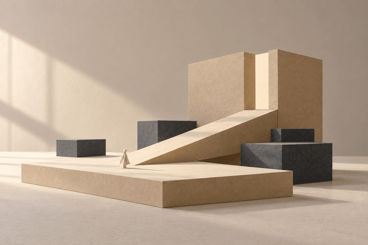
3dtotal’s edition description identifies a 272-page hardcover, ISBN 9781915992048. Kho’s own website says the book includes numerous Slack conversations between concept artist Kho and game designer Thierry Boulanger about story, mechanics and aesthetics. This is a claim about exchanges reproduced in the volume, not access to the team’s private archive or a quotation from those messages.
Conversation changes the reading purpose. A design may be answering a requirement that its final image does not announce. Where the book supplies an exchange, read the brief and response together: what was being asked for, what possibility was offered, and what remained undecided? The interesting evidence may sit in the relation between a drawing and a request, rather than inside the drawing alone. Nor should a concept art credit be stretched into authorship of every finished pixel asset. This book’s described format offers a way to follow collaboration while keeping the roles and stages of work distinct.
8. Eastward: Design Works — connecting art with the rest of a place
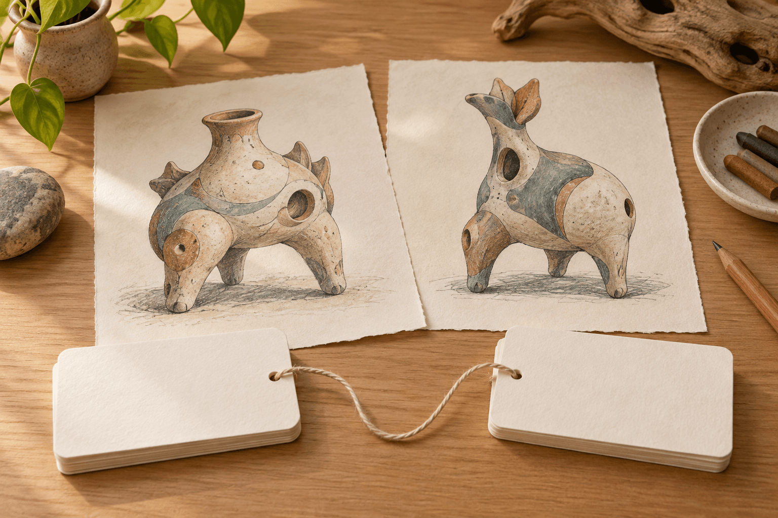
Lost in Cult’s publisher overview describes artwork, analysis and interviews with Eastward’s creators and composer. It also describes attention to environments, local cuisine and the in-house engine. The standard edition’s specifications give an A4 softcover with approximately 250 pages; the overview credits Shaun Hughes. The publisher’s descriptive copy retains some future-tense wording, so this account reports its stated scope rather than independently confirming the completed book’s contents. Deluxe extras are outside the selected standard edition.
The reading purpose is to ask what joins a place together. A street is experienced through more than its façades: sound, food, character movement and the systems supporting them may all contribute. The advertised breadth makes those connections worth pursuing. Follow an explanation across disciplines before deciding that the art alone supplies the atmosphere. If material on an engine sits beside discussion of a location, ask which practical possibilities it enables; if music is discussed, ask how its account of a place complements the visual one.
9. The Art of Cuphead — thinking in intervals
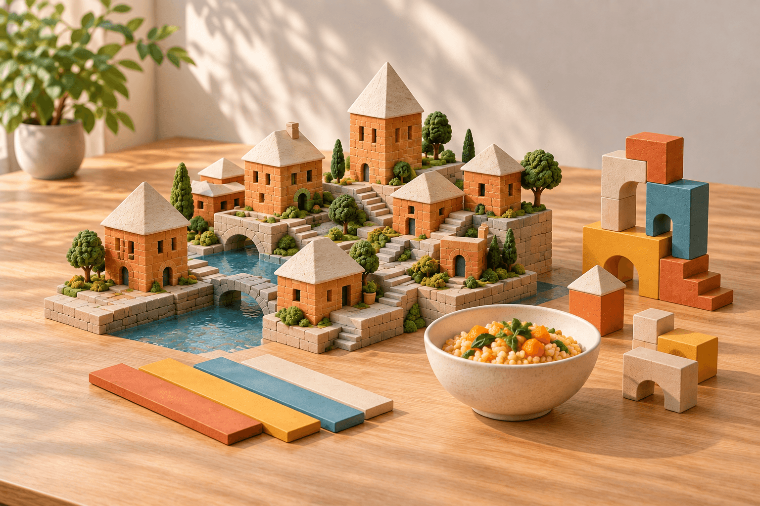
Dark Horse’s description presents early concepts and production work alongside an account of traditional drawing-based, frame-by-frame animation. It identifies insights from game directors Chad and Jared Moldenhauer. The publisher-distributor’s edition record fixes the selected hardcover at 264 pages, ISBN 9781506713205, published March 17, 2020. This entry concerns that game art book.
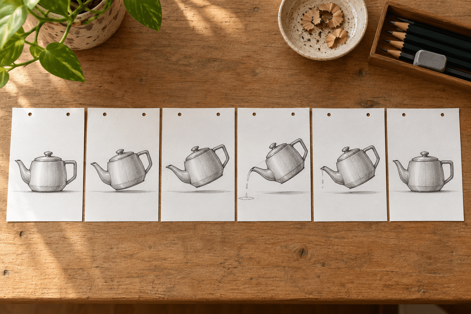
A single expressive pose can conceal the work needed to reach it and leave it. The useful reading question is therefore about intervals: what would have to change between one drawing and the next for weight, anticipation or impact to register? Where production material permits such comparison, slow down the gesture rather than admiring only a finished character. A still picture offers shape and arrangement; movement also needs duration. This approach follows the publisher’s emphasis on animation work without asserting that a particular set of consecutive drawings has been inspected here. It makes room for the labour between images as well as the appeal of any one image.
10. The Art of Hyper Light Drifter — understanding a chosen constraint
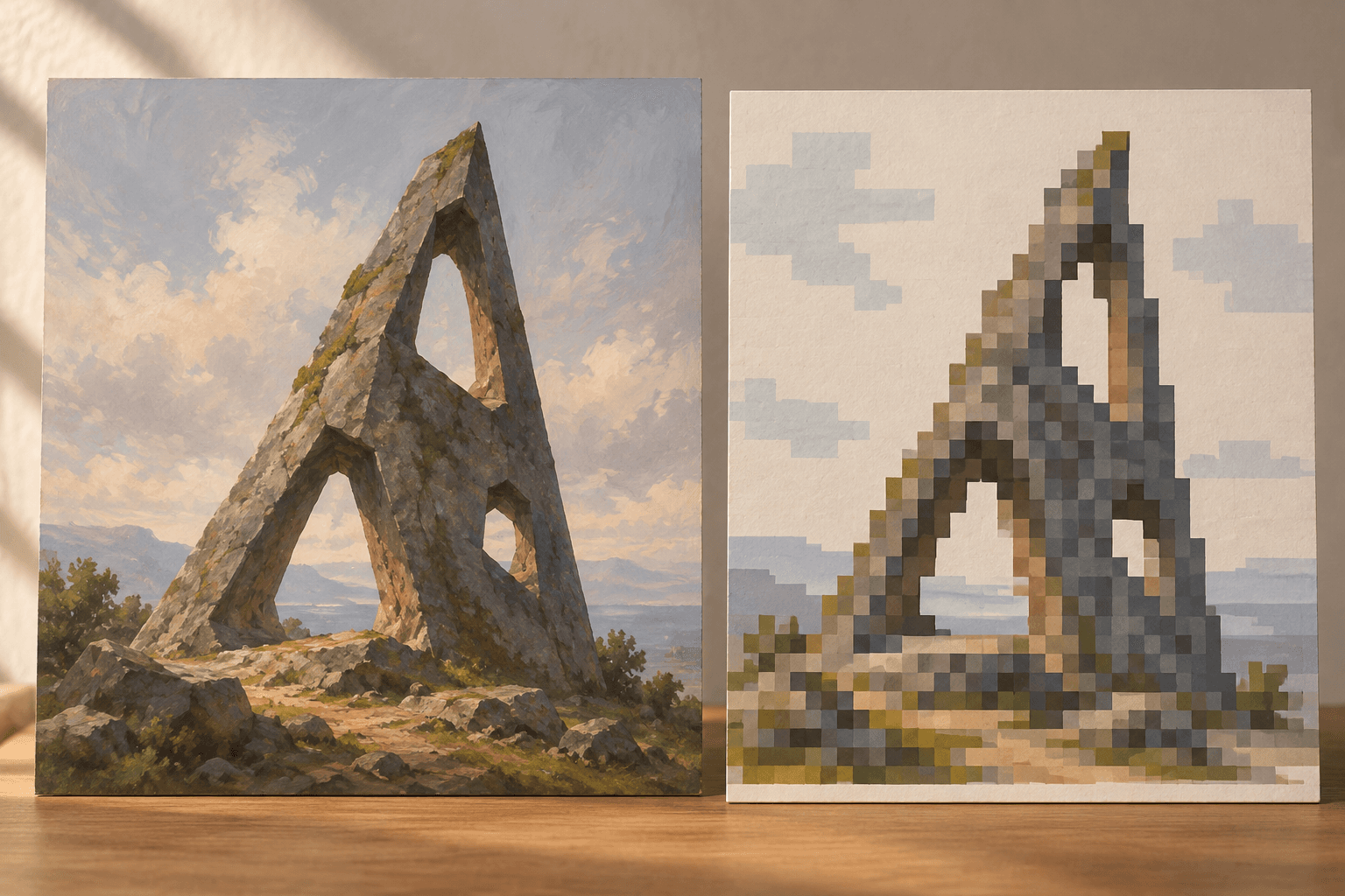
Fangamer’s official description identifies a 220-page hardcover containing sketches, sprites, notes and finished art, with a foreword by Alx Preston. The supplied description does not establish a publication date or ISBN, so those details remain unspecified here. In a separate 2017 interview with Alex Wawro, Preston explains that a 480 × 270 resolution constrained detail while other aspects were more flexible. He distinguishes homage from replication.
That distinction turns the reading away from a vague appeal to old hardware and towards a particular design problem. When considering the listed sketches and sprites, ask how an idea might be made legible with a limited number of pixels. What needs to survive, and what can be suggested? A painting and a sprite can use different means to carry a related mood without becoming a literal before-and-after pair. The external interview supplies context for the game’s constraint; it does not establish a conversion process for every image in the volume. Read for choices made within a limit, rather than treating the limit as the whole explanation.
A question to carry back to the game
These purposes need not produce the same kind of notes. One book invites an archive timeline; another suggests comparing materials; another makes a conversation or a production constraint the starting point. Pick one manageable question before opening a volume. Record what an image shows, what a caption or interview actually explains, and what remains your inference. On returning to the game, that question can direct attention towards a garment, a doorway or the interval between two poses. The reward is a more precise account of how an image works, with room left for what the evidence cannot settle.